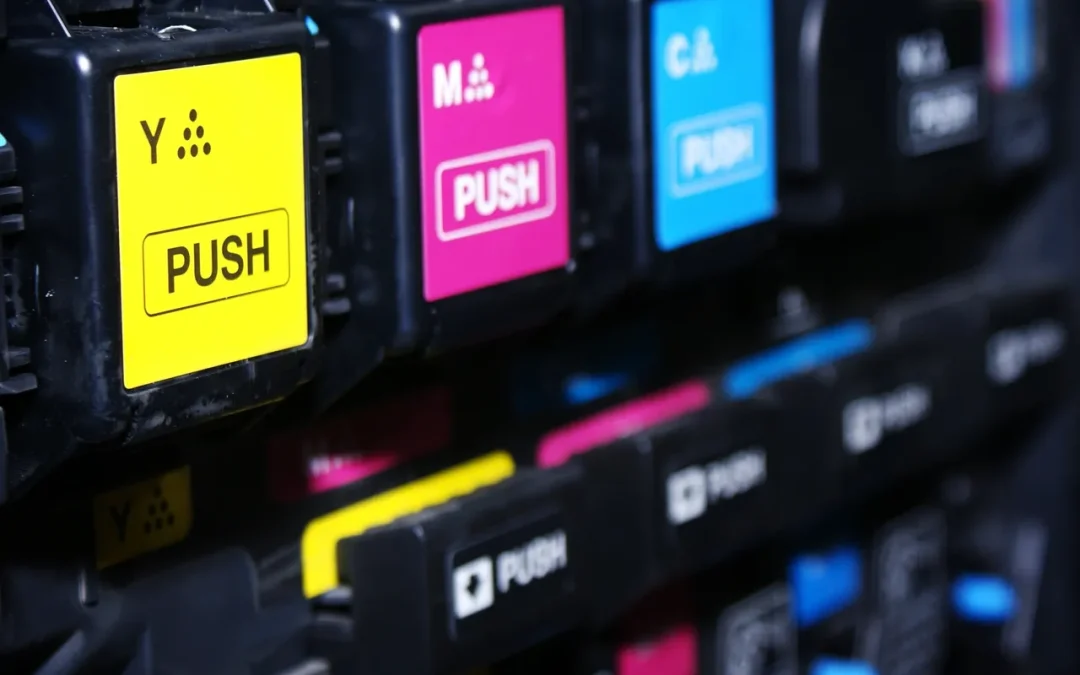
When it comes to business printing—whether it’s brochures, flyers, business cards, or reports—color choice can make or break your message. The right hues grab attention, convey professionalism, and align with your brand, while the wrong ones can confuse or repel your audience. As of April 2025, with printing tech sharper than ever, here’s a rundown of the best colors to use in business printing and why they work.
Blue: Trust and Professionalism
Blue is a perennial favorite in business printing for a reason—it screams reliability. From navy to sky blue, it’s associated with stability, trust, and competence, making it ideal for corporate materials like letterheads or annual reports. Pair it with white or gray for a clean, polished look. Just avoid overusing dark shades, which can feel cold if not balanced with warmer tones.
Black: Timeless Sophistication
Nothing beats black for a sleek, professional vibe. It’s perfect for text-heavy documents or minimalist designs, offering maximum readability and a sense of authority. Use it sparingly in logos or accents to avoid overwhelming the page—too much black can feel stark or funeral-like. Pair it with a bold accent color (like red or yellow) for contrast that pops.
White: Clarity and Versatility
White isn’t just a background—it’s a power player. It creates breathing room, enhances readability, and makes other colors stand out. In business printing, white space keeps designs from feeling cluttered, which is key for proposals or marketing collateral. It’s also cost-effective, as it doesn’t require ink, making it a practical choice for tight budgets.
Green: Growth and Approachability
Green signals growth, sustainability, and friendliness, making it a go-to for businesses in finance, health, or eco-friendly sectors. Light greens feel fresh and inviting, while deeper shades suggest wealth and stability. Use it in moderation—too much can overwhelm or clash with other elements. Pair it with neutrals like beige or white for balance.
Red: Boldness and Urgency
Red demands attention. It’s great for calls-to-action, sale flyers, or highlighting key points, as it evokes energy and urgency. But use it sparingly—too much red can feel aggressive or chaotic, undermining a professional tone. Combine it with black or white to keep it sharp without overdoing it.
Tips for Success
- Brand Alignment: Stick to your company’s color palette to reinforce identity—consistency is key.
- Contrast: Ensure text and background colors differ enough for readability (e.g., black on white, not yellow on white).
- Printing Reality: Test colors on paper—screen hues often look different in print due to ink and paper quality.
- Audience: Know your crowd. Bright colors might suit a creative startup, while muted tones fit a law firm.
In business printing, color isn’t just decoration—it’s strategy. Blue, black, white, green, and red top the list for their versatility and impact. Choose wisely, and your printed materials will do more than inform—they’ll impress.
Call us today to discuss how to implement color printing in your business for less:
Northwest Office Solutions 503-707-3006

